Visualization and coding
A selection data visualization, analyses, and applications I’ve developed.
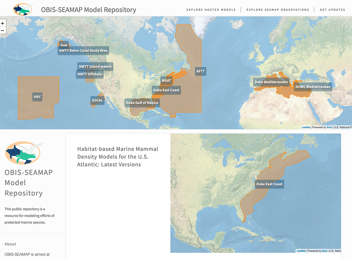
SEAMAP protected species modeling repository and data system
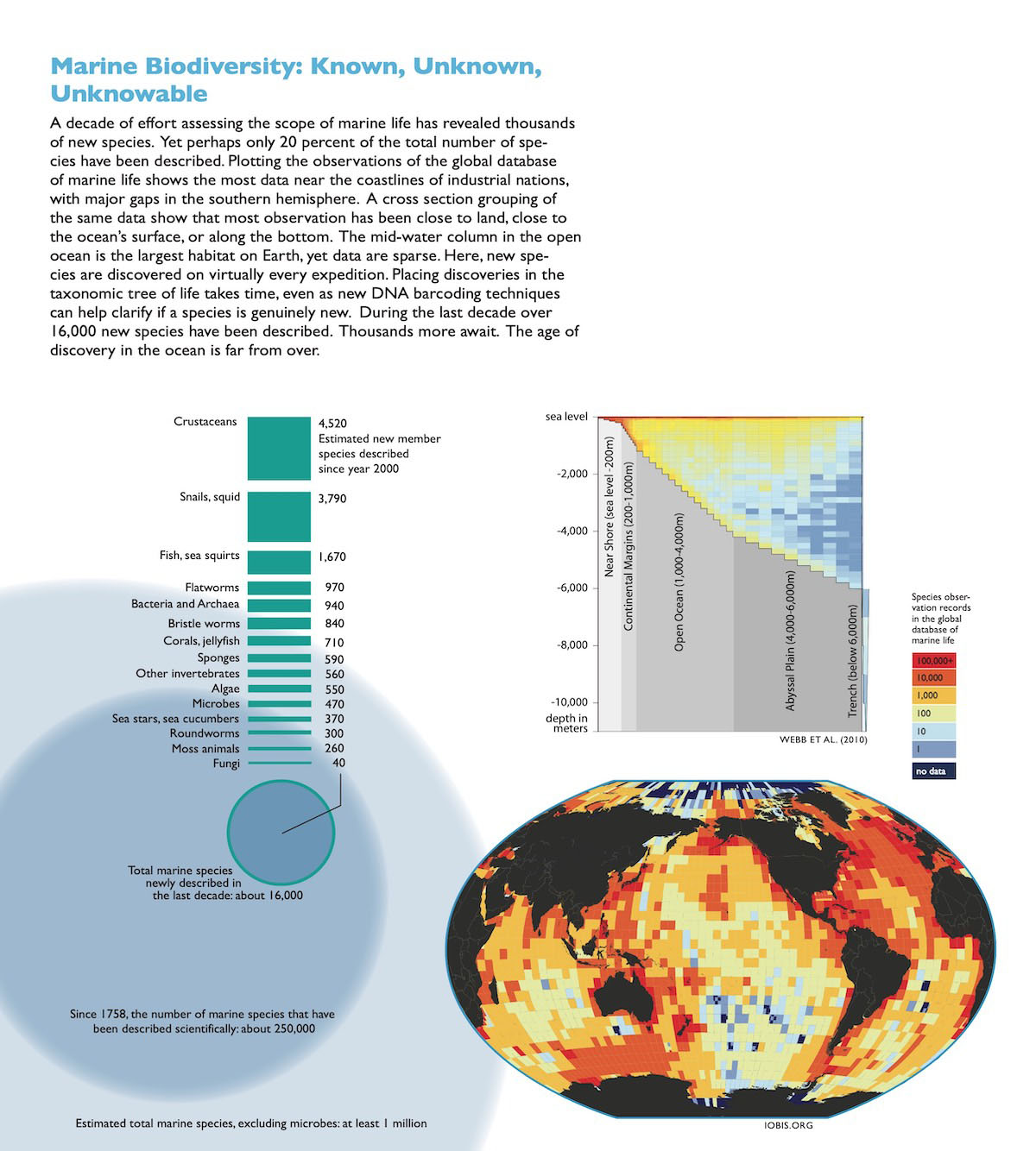
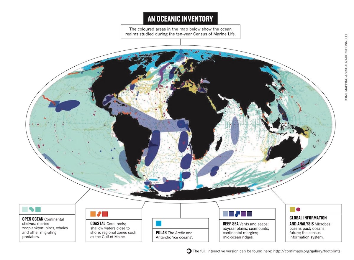
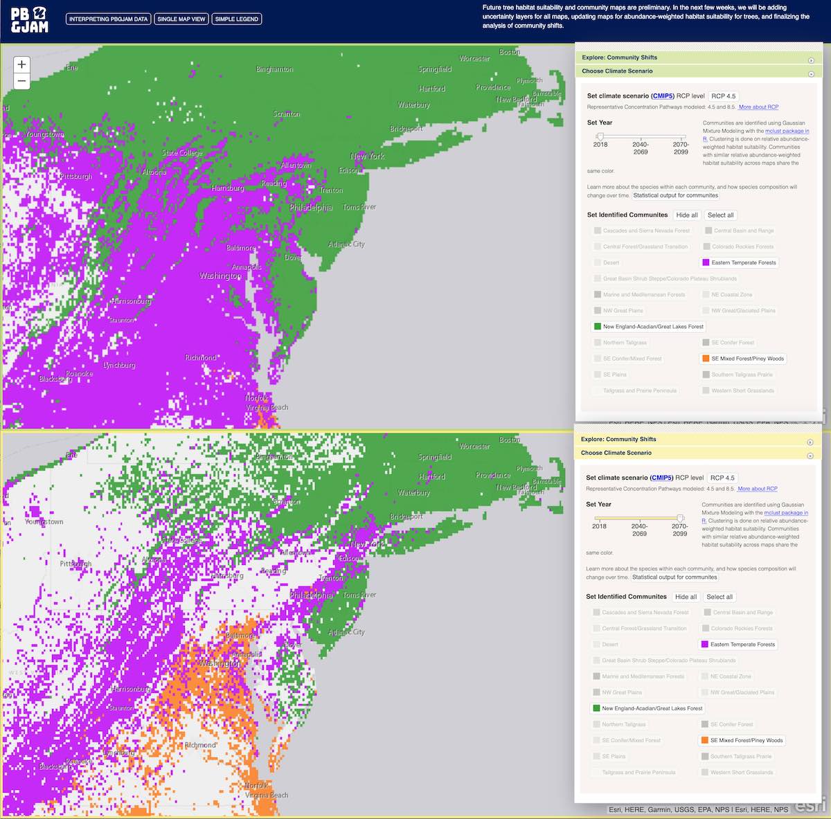
A data repository project to meet the needs of reproducible research, data product publishing and visualization. It’s part of the larger SEAMAP (Spatial Ecological Analysis of Megavertebrate Populations) data repo and explorer, which in turn is part of the OBIS and GBIF network, cataloging biodiversity, taxonomic and observation data. Tech backend: The site houses habitat models of whales and other protected species. Each generation of these outputs are tracked in GIT, with metadata stored in YAML. The yaml is parsed by a Node.js static site generator to build the pages and tables. The maps are Leaflet.js, pulling polygon info from a master shapefile maintained with QGIS. Updates are pushed out several times a year, as datasets are updated and new modeling projects are added. Because the models are used to set species protections, it is essential to track each generation of the models as policies are implemented. So the project knits together three GIT repos — one for the models, one for building the site, and one for the final html. This allows for a very detailed audit trail. An RSS feed aggregator created to facilitate my daily news browsing. GitHub source here As part of the vis team for the decade-long Census of Marine Life, I produced maps, graphics and web applications synthesizing and summarizing the world-wide effort to establish a biodiversity baseline for marine species. Below is a detail from a wall-size map produced with National Geographic. The segment describes the scope and gaps of biodiversity data. This graphic appeared in Nature for their reporting on the Census. Though the data was initially managed with ArcGIS, most of the work was in Adobe Illustrator utilizing spatial plugins. Full article here https://doi.org/10.1038/467514a A 2022 analysis prepared for a RFP looking at increased rates of motor-neuron deaths in North Carolina, possibly correlated with environmental factors. While this image is cartographic, the analysis was not primarily spatial — twenty-one years of death records were aggregated and normalized, extracting IDC-10 codes related to motor-neuron disease as a cause of death. Each record stored zip code of residence, so exposure is assessed by indexing zip code to the environmental factors of concern, rather than direct geographic distance measure. The analysis was done with Jupyter notebooks and VisiData. Mapping in ArcGIS, exported to Adobe Illustrator for clean-up and conversion to SVG. PBGJAM is a terrestrial ecology project using Dr. James Clark’s GJAM model. I created the explorer application for the outputs, showing how climate models will affect tree, mammal, bird and beetle habitat. This app provides controls for multiple climate scenarios, pinpointing specific species ranges under different scenarios, and how communities of species could change. Tech details: JavaScript single page application using dojo.js/arcgis.js. The model outputs are raster data, served to the web by ArcGIS for Server, complemented by statistical exploration R app served by Shiny. Extra species data pulled from NatureServe REST API and other web services.
FeedCourt

Census of Marine Life Mapping and Visualization
Hotspots of motor-neuron related deaths in North Carolina 1999-2020
Predicting biodiversity with generalized joint attribute models


